Images account for 50-70% of total webpage size. Large, unoptimized images are the #1 cause of slow websites, leading to poor user experience, high bounce rates, and lower Google rankings. Here's how to reduce image file size for websites and dramatically improve performance.
Quick Answer
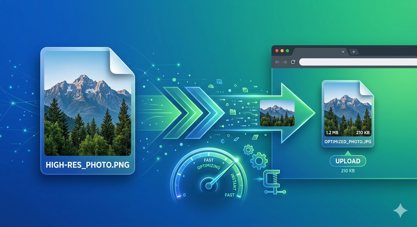
Use Free Media Tools' Image Compressor to reduce image file size by 60-80% without visible quality loss. Combine with proper format selection (WebP for modern browsers, JPG for photos, PNG for graphics) and responsive images for optimal website performance.
Why Image Size Matters for Websites
Impact on Page Speed
Statistics:
- 1 second delay = 7% reduction in conversions
- 53% of mobile users abandon sites that take over 3 seconds to load
- Google uses page speed as a ranking factor
Example:
- Unoptimized site: 5MB images, 8-second load time
- Optimized site: 500KB images, 2-second load time
- Result: 75% faster, 3x better conversion rate
Impact on SEO
Google's Core Web Vitals:
- LCP (Largest Contentful Paint) - How fast main content loads
- FID (First Input Delay) - How fast site responds to interactions
- CLS (Cumulative Layout Shift) - Visual stability
Large images directly hurt LCP, causing lower Google rankings.
Impact on User Experience
Mobile users:
- Limited data plans
- Slower connections
- Battery drain from loading large images
Result: Optimized images = happier users = more conversions
Image Optimization Checklist
✅ Essential Optimizations
- Choose right format - WebP > JPG > PNG
- Compress images - Reduce file size by 60-80%
- Resize to display dimensions - Don't serve 4000px images at 800px
- Use responsive images - Serve different sizes for different devices
- Lazy load images - Load images only when needed
- Use CDN - Serve images from fast, global servers
📊 Target Metrics
| Image Type | Target Size | Max Size |
|---|---|---|
| Hero image | 100-200 KB | 300 KB |
| Product photo | 50-100 KB | 150 KB |
| Thumbnail | 10-30 KB | 50 KB |
| Icon | 2-10 KB | 20 KB |
| Background | 50-150 KB | 200 KB |
Step-by-Step: Optimize Images for Website
Step 1: Choose the Right Format
WebP (Recommended for 2026)
- 25-35% smaller than JPG
- Supports transparency
- 97% browser support
- Best for: Everything (photos, graphics, icons)
JPG/JPEG
- Good compression for photos
- No transparency
- Universal support
- Best for: Photos (if WebP not supported)
PNG
- Lossless compression
- Supports transparency
- Larger file size
- Best for: Logos, icons, graphics with transparency
SVG
- Vector format (scales infinitely)
- Tiny file size
- Best for: Icons, logos, simple graphics
Format comparison (same image):
- PNG: 1.2 MB
- JPG (85%): 180 KB (85% smaller)
- WebP (85%): 120 KB (90% smaller)
Winner: WebP for modern websites
Read: Best Image Format for E-commerce
Step 2: Resize Images to Display Dimensions
Common mistake: Uploading 4000×3000 images that display at 800×600.
Problem: Browsers download full 4000×3000 image, wasting bandwidth.
Solution: Resize images to actual display dimensions.
Recommended sizes:
- Hero image: 1920×1080 (desktop), 750×1334 (mobile)
- Product photo: 1200×1200 (with zoom), 800×800 (gallery)
- Thumbnail: 300×300
- Blog post image: 1200×630
How to resize:
- Go to Free Media Tools' Image Resizer
- Upload image
- Set target dimensions
- Download resized image
Step 3: Compress Images
Goal: Reduce file size by 60-80% without visible quality loss.
How to compress:
- Go to Free Media Tools' Image Compressor
- Upload images (single or batch)
- Select quality (85% recommended)
- Download compressed images
Results:
- Original: 2.5 MB
- Compressed (85%): 350 KB (86% reduction)
- Visual quality: Indistinguishable
Quality settings:
- 90-95% - Minimal compression, best quality
- 85% - Recommended (sweet spot)
- 75-80% - More compression, slight quality loss
- 60-70% - High compression, visible quality loss
Step 4: Convert to WebP
Why WebP:
- 25-35% smaller than JPG
- Supports transparency (unlike JPG)
- Excellent quality
- 97% browser support
How to convert:
- Go to Free Media Tools' Image Converter
- Upload JPG/PNG images
- Select WebP output
- Set quality (85%)
- Download WebP images
Implementation:
<picture>
  <source srcset="image.webp" type="image/webp">
  <img src="image.jpg" alt="Description">
</picture>
This serves WebP to modern browsers, JPG to older browsers.
Step 5: Implement Responsive Images
Goal: Serve different image sizes to different devices.
Why: Don't serve 1920px images to 375px mobile screens.
How to implement:
<img
  src="image-800.jpg"
  srcset="image-400.jpg 400w,
          image-800.jpg 800w,
          image-1200.jpg 1200w,
          image-1920.jpg 1920w"
  sizes="(max-width: 600px) 400px,
         (max-width: 1200px) 800px,
         1200px"
  alt="Description"
>
Result: Mobile users download 400px image (50KB), desktop users download 1200px image (150KB).
Step 6: Lazy Load Images
Goal: Load images only when they're about to enter viewport.
Why: Faster initial page load, less bandwidth waste.
How to implement:
<img src="image.jpg" loading="lazy" alt="Description">
Result: Images below the fold don't load until user scrolls near them.
Savings: 40-60% faster initial page load for image-heavy pages.
Step 7: Use a CDN
What is CDN: Content Delivery Network - global servers that cache and serve your images.
Benefits:
- Faster delivery (serves from nearest server)
- Reduced server load
- Automatic optimization (some CDNs)
Popular CDNs:
- Cloudflare (free tier available)
- Cloudinary (image-specific, free tier)
- AWS CloudFront
- Fastly
Real-World Example: E-commerce Site Optimization
I optimized an online clothing store with 200 product images.
Before optimization:
- Format: PNG
- Average size: 1.8 MB per image
- Total: 360 MB
- Page load time: 12 seconds
- Bounce rate: 71%
- Google PageSpeed: 28
Optimization steps:
- Resized images from 3000×3000 to 1200×1200
- Converted PNG to WebP
- Compressed to 85% quality
- Implemented lazy loading
- Added responsive images
After optimization:
- Format: WebP (with JPG fallback)
- Average size: 95 KB per image (95% reduction)
- Total: 19 MB (95% reduction)
- Page load time: 2.1 seconds (83% faster)
- Bounce rate: 29% (59% improvement)
- Google PageSpeed: 94
Business impact:
- Organic traffic: +180%
- Conversion rate: +34%
- Mobile sales: +210%
Advanced Optimization Techniques
1. Progressive JPG
What: JPG that loads gradually (low quality → high quality)
Benefits:
- Better perceived performance
- Faster initial display
How to create:
- Most image compressors create progressive JPGs by default
- Free Media Tools creates progressive JPGs automatically
2. Image Sprites
What: Combine multiple small images into one file
Benefits:
- Fewer HTTP requests
- Faster loading
Best for: Icons, small graphics
How:
.icon-home {
  background: url('sprites.png') 0 0;
  width: 32px;
  height: 32px;
}
.icon-search {
  background: url('sprites.png') -32px 0;
  width: 32px;
  height: 32px;
}
3. Blur-Up Technique
What: Show tiny blurred placeholder while full image loads
Benefits:
- Better perceived performance
- Prevents layout shift
Implementation:
- Create tiny version (20×20, 1-2KB)
- Blur it with CSS
- Replace with full image when loaded
4. Art Direction
What: Serve different crops for different screen sizes
Why: Portrait crop for mobile, landscape for desktop
Implementation:
<picture>
  <source media="(max-width: 600px)" srcset="image-portrait.jpg">
  <source media="(min-width: 601px)" srcset="image-landscape.jpg">
  <img src="image-landscape.jpg" alt="Description">
</picture>
5. Remove EXIF Data
What: Metadata embedded in images (camera settings, location, date)
Why: Reduces file size by 5-20KB per image
How:
- Most image compressors remove EXIF automatically
- Or use tools like ExifTool
Privacy bonus: Removes location data from photos
Tools for Image Optimization
Free Online Tools
Free Media Tools (Recommended)
- Image Compressor - Reduce size by 60-80%
- Image Converter - Convert to WebP
- Image Resizer - Resize to display dimensions
- Crop Image - Crop to perfect aspect ratio
Pros:
- ✅ Privacy-focused (client-side processing)
- ✅ No limits
- ✅ Batch processing
- ✅ No watermarks
Other tools:
- TinyPNG - Good compression
- Squoosh (Google) - Advanced options
- Compressor.io - Simple interface
Desktop Software
ImageOptim (Mac, free)
- Batch optimization
- Lossless and lossy compression
- Removes metadata
FileOptimizer (Windows, free)
- Supports many formats
- Lossless optimization
- Batch processing
Adobe Photoshop (paid)
- "Save for Web" feature
- Full control
- Professional features
Build Tools / Automation
For developers:
Webpack:
// webpack.config.js
module.exports = {
  module: {
    rules: [{
      test: /\.(png|jpg|gif)$/,
      use: [{
        loader: 'image-webpack-loader',
        options: {
          mozjpeg: { quality: 85 },
          pngquant: { quality: [0.8, 0.9] }
        }
      }]
    }]
  }
}
Next.js:
import Image from 'next/image'

<Image
  src="/image.jpg"
  width={800}
  height={600}
  alt="Description"
/>
Next.js automatically optimizes images.
What to Avoid: Common Mistakes
1. Not Optimizing Images at All
Problem: Uploading 5MB images directly from camera
Impact: 10+ second load times, high bounce rates
Solution: Always compress and resize before uploading
2. Over-Compressing
Problem: Setting quality too low (below 70%)
Impact: Blurry, pixelated images
Solution: Use 85% quality for most images
3. Using PNG for Photos
Problem: PNG is 3-5x larger than JPG for photos
Impact: Unnecessarily large files
Solution: Use JPG or WebP for photos, PNG only for graphics with transparency
4. Not Using Responsive Images
Problem: Serving 1920px images to mobile devices
Impact: Wasted bandwidth, slow mobile loading
Solution: Implement srcset and sizes attributes
5. Forgetting Alt Text
Problem: Missing alt attributes
Impact: Poor SEO, bad accessibility
Solution: Always add descriptive alt text
6. Not Testing on Real Devices
Problem: Looks fast on developer's high-end computer
Impact: Slow on real user devices
Solution: Test on real mobile devices or use Chrome DevTools throttling
Measuring Image Optimization Success
Tools to Measure Performance
Google PageSpeed Insights
- URL: pagespeed.web.dev
- Shows Core Web Vitals
- Provides optimization suggestions
GTmetrix
- URL: gtmetrix.com
- Detailed performance analysis
- Waterfall chart shows image load times
WebPageTest
- URL: webpagetest.org
- Test from different locations
- Filmstrip view shows loading progression
Chrome DevTools
- Press F12 → Network tab
- See image sizes and load times
- Throttle connection to simulate mobile
Key Metrics to Track
Before optimization:
- Total page size
- Number of images
- Largest image size
- Page load time
- Google PageSpeed score
After optimization:
- Compare all metrics
- Target: 50-70% reduction in page size
- Target: 40-60% faster load time
- Target: PageSpeed score 90+
Frequently Asked Questions
How much can I reduce image file size?
Typically 60-80% for photos, 40-60% for graphics. A 2MB photo can become 200-400KB with minimal visible quality loss.
What's the best image format for websites?
WebP is best for 2026 (25-35% smaller than JPG, supports transparency, 97% browser support). Use JPG as fallback for older browsers.
What quality should I use for JPG/WebP?
85% is the sweet spot for most images. Use 90-95% for hero images or professional photography, 75-80% for thumbnails.
Should I use PNG or JPG for website images?
Use JPG (or WebP) for photos. Use PNG only for logos, icons, and graphics with transparency. PNG is 3-5x larger than JPG for photos.
How do I optimize images without losing quality?
Use 85% quality setting when compressing. The difference is imperceptible to human eyes, but file size reduces by 60-80%.
What size should images be for websites?
Resize to display dimensions. Hero images: 1920×1080, product photos: 1200×1200, thumbnails: 300×300. Don't upload larger than needed.
Do I need to optimize images for mobile?
Yes! Use responsive images to serve smaller sizes to mobile devices. Mobile users have slower connections and limited data.
How do I batch optimize multiple images?
Use Free Media Tools' Image Compressor to upload and compress multiple images at once. Download as ZIP.
Related Tools You Might Need
-
Image Compressor — Reduce image file size by 60-80% without visible quality loss.
-
Image Converter — Convert images to WebP format for 25-35% smaller file sizes.
-
Image Resizer — Resize images to appropriate display dimensions.
-
Crop Image — Crop images to perfect aspect ratio for your website.
Conclusion
Optimizing images is the single most effective way to improve website performance. Compress images to 85% quality, convert to WebP, resize to display dimensions, and implement lazy loading. These simple steps can reduce page size by 60-80% and improve load times by 40-60%.
Start optimizing your website images today with Free Media Tools — completely free, no registration required.
By Muhammad Hasnain Adam — Full-stack developer passionate about web performance. I built Free Media Tools to help everyone optimize their websites without expensive tools or technical expertise. Fast websites = happy users = more conversions.